Quantcast
Channel: Tektura Blog
Viewing all 164 articles
Browse latest View live

MARCEL WANDERS Neo Royal

$
0
0

Described as the Lady Gaga of the design world, and a "constant font of ideas and energy, who is nearly impossible to ignore",  Marcel Wanders has now joined forces with our parent company to create NEO ROYAL.  This collection of wallcoverings has all the marks of Marcel Wander's signature style - a hint of humour mixed with historical references and futuristic vision.

Marcel draws heavily on historical themes, and adds his own contemporary twist.  Cool cream satins and inlaid white marble contrast sharply with regal golds, purples and black. Tiny fleur de lys and heraldic emblems are woven into more elaborate designs.

Backgrounds are encrusted with beads, diamonds and jewels,  while shards of crystal become kaleidoscopic patterns.  The vivid blues of Delft pottery are transformed into paint spatters and damasks.


If you'd like to see the full range, please follow this link

And to keep updated with all our new intros, just click here


PRIVATE RESIDENCE, MAYFAIR

$
0
0

Our wallcoverings are often found in luxury hotels and commercial spaces... but here our products have been selected for a residential setting with stunning results.

Designers Atelier di Spera chose numerous designs from our range for this private residence in Mayfair, London.  Let's have a look.

Textured tactile surfaces are key to the scheme:  Velvet upholstery, satin and quilting are pulled together in shades of taupe, mushroom and warm silver.  Starting with the bedrooms - the master bedroom features our wallcovering Orlean - a deeply textured, pleated silk effect. 

Guest bedrooms continue the neutral colour scheme, and here we can see Fiddleback - a finely printed woodgrain (or silk?). 

Moving to the lounge area, Luxe wallcovering offers an iridescent tiled effect  


The lounge also incorporates a feature wall of tiled mirrors (we felt compelled to show before/after pictures here - we hear it was a labour of love!).

And bathroom walls are covered in Rock Steady - another blocky textured design. All wallcoverings chosen are scrubbable and these vinyls have a fabric-backing for extra durability. This quality of wallcovering is designed specifically for hotels and public spaces, but textures, colours and pattern work equally well in residential settings. 


Interior designer : Atelier di Spera

If you'd like to find out more about the wallcovering designs featured here, please click on the following links : Fiddleback, Orlean, Luxe, Rock Steady. 

And our blog features plenty more case studies, news and views. 

MARCEL WANDERS Neo Royal

$
0
0

Described as the Lady Gaga of the design world, and a "constant font of ideas and energy, who is nearly impossible to ignore",  Marcel Wanders has now joined forces with our parent company to create NEO ROYAL.  This collection of wallcoverings has all the marks of Marcel Wander's signature style - a hint of humour mixed with historical references and futuristic vision.

Marcel draws heavily on historical themes, and adds his own contemporary twist.  Cool cream satins and inlaid white marble contrast sharply with regal golds, purples and black. Tiny fleur de lys and heraldic emblems are woven into more elaborate designs.

Backgrounds are encrusted with beads, diamonds and jewels,  while shards of crystal become kaleidoscopic patterns.  The vivid blues of Delft pottery are transformed into paint spatters and damasks.


If you'd like to see the full range, please follow this link

And to keep updated with all our new intros, just click here

NEW INTROS Spring 2017

$
0
0

We're delighted to introduce these new collections - each with it's own theme. 

Firstly, here's INDIAN SUMMER ... reminiscent of hazy days and a fusion of asian and western design. Handdrawn florals and paisley-inspired prints combine with weathered textures in soft coral tones mixed with slate grey and dusky purple. 

And LOFT.  Here we've taken our inspiration from art and urban living.  Designs are influenced by cubism;  prints create 3D effects, natural themes are stylised into dramatic shapes and soft layers.  Stark black and white dominates, with flashes of acid yellow, umber and purple. 

Soft, romantic GLASSYcompletes this trio of collections. Glassy is created with painterly layers, giving a diffused quality to the designs. Colours stay muted and combine peach, aqua and soft green. Fragile floral prints complement watercolour washes.  Alongside designs available in rolls, we've also created two larger-scale murals for dramatic effect.   

If you'd like to see all designs in each collection, please click on the following links :  INDIAN SUMMER, LOFT, GLASSY

To keep up to date with all our new intros, click here.


HALE COUNTRY CLUB & SPA

$
0
0

in 2016 the Hut Group acquired The Hale Country Club and Spa - a 50,000 sq ft fitness and beauty facility located in Hale, Cheshire. 

The new owners are one of Europe's fastest growing online retailers, and since the acquisition, they have embarked on a complete makeover of the club, starting with a £1.5 million refurbishment of the gym floor and spa area. The existing spa has been stripped out to create a bigger, light and more luxurious setting.  

The Hut Group themselves chose the interior finishes, including our Eastern Clouds design: a hand-made wallcovering comprising sheets of silver, gold and metal leaf mixed with silk threads.  See more like this here 

A new champagne lounge sits adjacent to the spa and overlooks the grounds.  Our wallcovering Coral Forest was selected and we custom-coloured the design to complement the soft taupe, natural wood and stone interior finishes.


If you're tempted to become a member ..... there's very long waiting list.

Meanwhile, to find out more about the designs featured, click on the links here : Rare Finds, Coral Forest 


St Pauls House, Birmingham

$
0
0

Dating back to the 1770's St Pauls Square was designed as a quiet corner away from the city centre, offering elegant homes to the affluent.  As trade expanded outwards however the properites were ultimately swallowed up and taken over by toymakers, silversmiths and the jewellery trade. 

St Pauls House is one of the square's original residential buildings but spent many years as an industrial workshop. Following a complete renovation by D5 Architects and an interior makeover by Elevate Property Group, the townhouse has been transformed back into luxury homes once again.

We're lucky enough to have our wallcoverings featured throughout the townhouse property. The designers have chosen patterns and textures that hint at an industrial past yet provide an elegant and laidback aesthetic. 

In selected bedrooms, this chevron print has been chosen from our ESSENTIALS COLLECTION.  Available in rolls 53cm wide x 10m, the Collection offers a mix of urban-inspired prints ranging from wood through to peeling paint, cork and kilim weaves.

LUCAS is a hard-wearing, fabric-backed vinyl. It's 137cm wide, scrubbable, impact resistant and, like all our vinyl wallcoverings, is fire rated for use in public areas.  The design is designed to mimic woven grasscloth and is offered in 18 colours. 

Below we show another design from our ESSENTIALS COLLECTION - this colourway is reminiscent of oxidised metal, but the same design is available in soft creams and white, mimicking smooth polished marble. 

And finally - the picture below shows a custom print we created for the dining area. This is our METAL TRIANGLES design - it can be recoloured and resized to fit any wall. We can print onto many different surfaces, offering smooth or stone textures, matt or metallic. 

And it's not only the interior that has been redesigned.  Birmingham-based Seven 9 Signs were commissioned to create the Peaky Blinders artwork for the courtyard wall. Here's the work in progress and the finished results.  

Artworks on interior walls and photography are courtesy of @ByTomBird 
Interiors by @elevatepropertygroupuk  


14 NEW designs

$
0
0

Natural surfaces, tactile textures and antiqued patterns are the theme behind our latest intros. 

All are fabric-backed vinyls : heavyweight, durable, scrubbable and fire rated so ideal for public areas, corridors and stairwells.  Let's have a look.

CORINTH is inspired by greco-roman architecture and ancient frescoed walls.  The smooth stone texture complements the fragility of the stencilled overprint.

Keeping with the theme of natural surfaces; TERRA and CORSA recreate a chiselled stone texture - in matt and pearl finishes.  HEAVY METAL is smooth, mimicking oxidised metals in colour combinations such as lapis and gold, black and terracotta, or antique white and sand.  In contrast MERCURY GLASS is fissured and textured, with flakes of metal ink glinting and glistening in deep crevices.  

And wood is good!  AGAINST THE GRAIN is matt, textured and weathered. Available in 6 colours, the planks are offset giving a seamless finish. 

TIMBER in contrast is self-coloured and iridescent. There's a hint of charred wood texture here and the design creates a very subtle panelled effect.   

With weaves as our backdrop, we also look to traditional print techniques from African, Asia and the Far East. BOHO STRIPE celebrates the art of shibori, tie-dye and batik.  It's certainly dramatic, and colours include vivid pink, grunge green and the simplicity of black and white.  

Fabric effects are key: JET SET is matt, with layers of colour creating depth and texture.BALSAis a rustic, random weave. CIMA shimmers with the tiniest hint of wood grain.

But if a sleeker style is your bag, you may like our latest intros BENGAL and BENGAL SILK. Using layers of slubby threads, Bengal Silk is set to become another best seller. Bengal takes the same background but with a bold Art deco-inspired overprint.  Colours also nod to the deco era,  concentrating on classic combinations of brass and black through to pale pistachio and pearl white.  

And keeping with the theme of weaves, silks and fabrics here's GYPSY. This offers a twist on traditional tapestry.  Threads are faded and worn evoking a sense of history and craftsmanship. 

If you'd like to find out more about our new intros, please click on the individual links here.   Corinth, Corsa, Terra, Heavy Metal, Mercury Glass,Against the Grain, Timber, Jet Set, Balsa, Cima, Boho Stripe, Bengal, Bengal Silk, Gypsy

To keep up to date with all our latest intros, just click here. 

And for case studies, news and views....click here!


Catering with a wow factor

$
0
0

The Hut Group have once again chosen our Rare Finds products  - hand made wallcoverings and tiles with a wow factor.  For this project, they were keen to create a commercial catering facility to function as a canteen for around 250 people.

Encompassing everything from floor finishes, walls, ceilings, counters, furniture and D&B for the back of house kitchen, Space Interiors provided a full turnkey service, and completed the project in just 13 weeks.

For the walls, our design Pagoda was chosen for the feature area behind the canteen. This antiqued gold design is from our Rare Finds collection and made with metal leaf applied over a textured background. 

Our Crackle design is another hand made product. Created with resin, these rigid tiles are then precision cut and fissured. Over 100 tiles were used on this project as splashbacks and framing seating cubicles.

If you'd like to find out more about the wallcoverings used here - please click here 


RAINBOWS CHILDRENS HOSPICE office refurb

$
0
0

Rainbows are a Loughborough based charity offering respite care to children in the East Midlands area. 

The charity approached Blueprint Workplace with a brief to redesign their offices, developing a better working environment for staff and volunteers.  

Cramped over two floors, the first step was to create room.  Several partitions were dismantled and an open plan and collaborative workspace created. 

Rainbow's bright house colours were used wherever possible - not only to showcase their brand but to help create a bright, vibrant space.  Multiple breakout areas and huddle spaces were incorporated into the scheme. 

Blueprint reached out to their own suppliers and subcontractors to support the project and in their own words, the response was 'fantastic'.  Many industry suppliers have been involved in this project, and we're delighted to have been a very small part of this - perhaps you can spot our Walltalker dry-erase wallcovering here and there.


If you'd like to read more about the beginnings of this project, click here 


£2.75m new build and office interiors

$
0
0

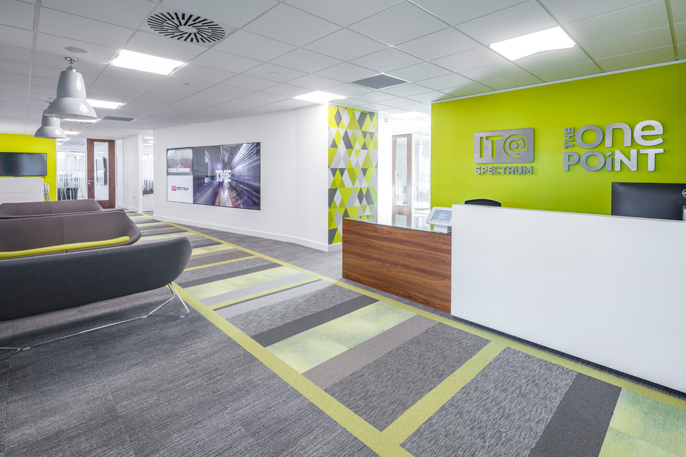
15,000 square feet and 3 storeys high, these impressive offices are the new hub for IT@Spectrum and sister company The One Point. 

Branded as "The View", the Bridgehead-based offices are purpose designed, enabling the new owners to offer clients a 'living showroom' experience where they can see IT@Spectrum's latest print and office automation systems in action. 

Informal meeting points can be found throughout, and each area is defined with colour blocking in the flooring. 

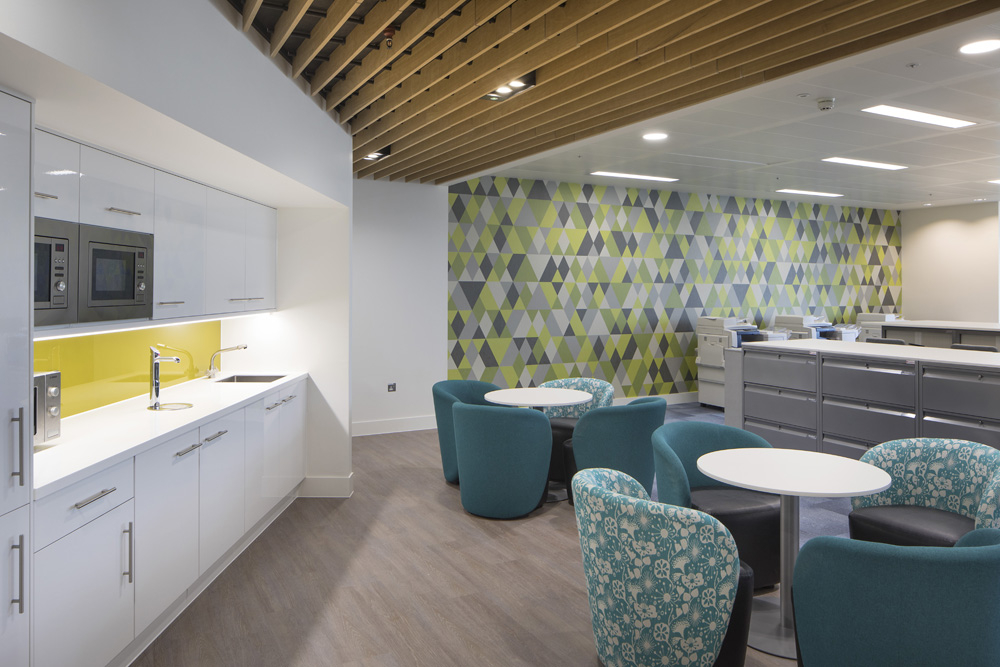
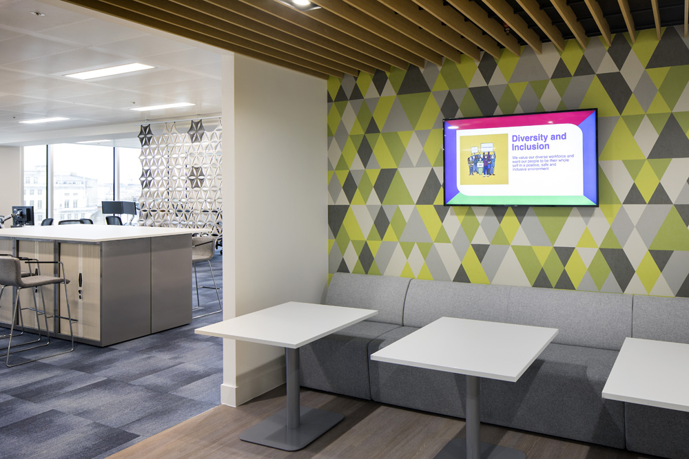
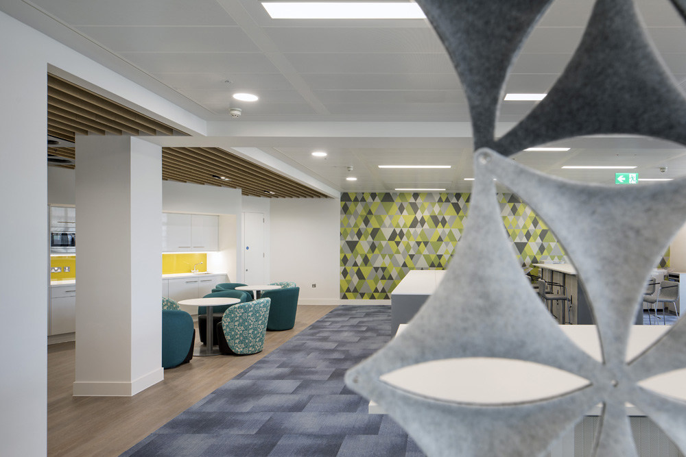
Interiors were designed by Be Inspired, who chose Tektura wallcoverings.  The triangle prints are part of our Jonnie Lawes collection; a range of geometrics all of which are easy to custom colour.  

For this project, we customised the colours to match the client's own branding.  Colours in 'Triangles Too' (above) were desaturated to create a monochrome effect. We also tweaked 'Triangles Citrine' (below) to match the acid green and yellow colours in the upholstery and flooring. 

For general office areas, concrete and brick effect wallcoverings were selected from our More than Elements collection . 

Property Development : Wykeland.   Interiors : Be Inspired Design / Chameleon Business Interiors

If you'd like to find out more about the wallcoverings featured, please click here : Jonnie Lawes, More than Elements

NEW DESIGNS and trends for September 2017

$
0
0

Art Deco and modern geometrics, timeless weaves; tactile textures, rustic grasscloths; natural surfaces, suede, patina.  Let's have a look at our 19 new designs and the thinking behind them...

What comes to mind when we talk about classic design? Perhaps geometric styles like Art Deco, Moroccan architecture and traditional Japanese craft like Kumiko? Or maybe timeless weaves, silks, linens and grasscloths - but behind the scenes we've been investigating how these styles are evolving.

We're seeing lines becoming sleeker and sharper, patterns are laser cut and less fussy. Materials used have also changed – metallics are finding their way into design, creating gleaming seams and highlights. We see the introduction of new materials such as denim into interior design. New technology also gives us the opportunity to create flexible wire mesh fabrics, with metal threads woven into designs. The effect is understated and luxurious.  

We have all embraced the warmth of rustic, raw, coarse and weathered surfaces in neutral and natural colours. The look is all about chunky weaves, natural fibres, raffia and rattan. But how is this look changing?

Rustic doesn’t have to mean inelegant. It can be sleeker and smarter, and that’s where we see this style progressing. Designs have been elevated; they're more sophisticated and refined. We're seeing structure;  linear, lattice and mesh effects merge with industrial elements. There's still a hint of natural as weaves evolve into stylised plaids and tweeds while colours shift from warm neutrals to a more monochrome palette. Pops of tomato red and burnt orange make an entrance.

Natural surfaces are big news, and it's all about texture and touch. We have such a high demand for these effects so we've been busy developing new variations on this style. 

We’re looking at stone effects, patinated and oxidised metals, polished plaster and smooth suede. There are wood textures, chiselled effects, weathered surfaces and quartz-like designs coming through - layers of colour merge adding depth with just a glint of metal here and there. 

All our new intros are fabric-backed vinyls: heavyweight, durable, scrubbable and fire rated so ideal for public areas, corridors and stairwells.   If you'd like to find out more about any of these designs, please click on the individual links here: Asterix, BazaarBelize, Calabash, Chameleon StripeFandango, Lombardy, MetallixPalazzo, Palazzo Silk, Panache Plaid, Patina Stone, Patina Stripe, Rhinestone, Suede, Trail, Venetian Silk, VoyagerWhittle

To keep up to date with all our latest intros, just click here.

And for case studies, news and views....click here!

Dates for your Diaries!

$
0
0

We're going to be showing at lots of events in the next couple of months - find out more below and click on the links to register for your places!

Grand Designs Live 2017

$
0
0

When Grand Designs invited two of our clients to showcase their work at this year's Grand Room Sets feature, we wanted to share their adventure with you.  Suki Shocker and Samatha Theakstone both approached us to help with wallcoverings. Here's how it all panned out.

The brief was "to create a room based on a popular interior design trend".  Suki Shocker mixed high-end product with low cost pieces and followed his ethos of creating an overall look of luxury on a budget...without sacrificing design.   

Presented with a space 4m x 4m, the work began. 

For Suki Shocker, textures are a key feature.  Amphora cork and Skyward woven silk wallcoverings are by Tektura;  oak flooring by Interface; chunky geometric upholstery by Panaz.  All are complemented by the dramatic lighting by R & S Robertson and clean lines of the furniture by Boss Design.  Mirrors, picture frames, occasional tables and accessories were all sourced from Ikea.  Artworks were downloaded from internet image libraries and printed locally. Colours are dark and moody, offset by gold, copper and bronze.  Click here for more about Suki Shocker

Samantha Theakstone meanwhile opted for a botanical theme. Her company's belief is that design should be accessible to all and this is reflected in the abundance of products she chose, all of which are readily available from respected retailers.

Samantha's botanical theme focused on earthy colours combined with blues and greens.  Flashes of yellow found their way into upholstery and floral photographic artwork. Timber effect flooring by Karndean, our Heritage Wood wallcovering and paint by Valspar created the backdrop for furniture by Eat Sleep Live, pottery by Denby, accessories by Lusso and Bell & Blue, flowers and foliage by Fox Flowers and lighting by Jam Jar and The Workshop.   Head over toSamantha's facebook page   for more.

If you'd like to find out more about the Grand Room Sets features, click here

To keep up to date with all our news, follow our blog andwhat's new

Merry Christmas 2017!

Laura Hart new ideas for geometric prints

$
0
0

LAURA HART designs are all about geometrics : dashes, grids, lines, oblongs and squares. 

With names like Peninsula, Platform and Mechanical - images of urban landscapes come to mind, and Laura's designs are clearly influenced by city scenes and industrial themes.   

You can also add your own twist on the theme.  How about creating your own colour?  Or moving elements of a design around... these designs are totally flexible and easy to customise.   Sections can be repeated and resized too.  

We can print on smooth white, or textured and iridescent backgrounds.  You choose.  All designs work equally well as wallcoverings and window film. 

Would you like to see more Laura Hart designs?   just click here.....

Laura also has her own company Surface House - and if you'd like to find out more - just click here www.surfacehouse.com

And if you're interested to know more about creating your own unique design...  Here's how. 


NEW LAUNCHES January 2018 - PART 2

$
0
0

Stop! Have you seen Part 1? Click here to read about Metropolis - the first half of our new January launches...

From the dark and moody Metropolis to the softer world of Utopia. Natural forms, organic shapes and surreal dreamscapes inspire our second group.

Metropolis witnessed looming skyscrapers, bold architecture, and urban cityscapes, but Utopia is all about bringing it back to basics to the forms and shapes we see in the natural world.

We've taken inspiration from geological formations, the fine wire sculptures of Anthony Gormley, dew-laden cobwebs and seams of molten metals. Swiftly we moved from the angles of urban architecture to organic shapes and textures: a softer, dreamier landscape. 

Dipping into history once more, we take inspiration from fossils (yes THAT far back!) and prehistoric rock formations including the Giant’s Causeway in Northern Ireland. 

Stone effects blend with muted earthy shades, soft blues and pinks merge with the vivid magentas of a vibrant sunset. We see primeval gaseous clouds and the aurea borealis meld with painterly pattern and soft shadowy shapes. 

All our new intros are fabric-backed vinyls: heavyweight, durable, scrubbable and fire rated so ideal for public areas, corridors and stairwells. If you'd like to find out more about any of our Utopia-inspired designs, please click on the individual links here: AmmoniteCausewayIllusionInk'dMineralWired.

Stop!  Have you seen our other January intros? Click here to read aboutMETROPOLIS : the first 6 of our new January launches...

To keep up to date with all our latest intros, just click here.

And for case studies, news and views....click here!

NEW LAUNCHES January 2018 - PART 1

$
0
0

Who'd have thought a 1920's silent film would influence our new designs? 

Made in the era of Art Deco, the iconic film by Fritz Lang embodies an edgier, darker and moodier style. Set in a futuristic urban dystopia, the silent film is known for its visual experience. Oozing an atmosphere of drama, we found ourselves obsessed with the shapes and angles of its looming architecture, teetering skyscrapers and steampunk mechanisms. We've embraced the symmetry, geometry and simplicity of the patterns and shapes the film projects.

We’re not alone in finding inspiration in the iconic film. You can detect its DNA in everything from Blade Runner to Star Wars…and you won’t find the influence of Metropolis stops there. Fashion designers such as Tom Ford, Versace, Max Mara and Givenchy have all captured elements of the film and its characters into their work. Sculptured shapes and metal seams are direct descendants of the film style; even pop icons Madonna and Lady Gaga have taken inspiration from Metropolis.

Let's have a look at our Metropolis inspired designs:

So what links a silent film with wallcoverings? As a silent film is unable to convey feeling and emotion through speech, it relies on its visual aspects to do the job for it - Something we believe a wallcovering design should be able to do too. 

Whichever way we look at it, our designs are linked directly back to the silent era - curves, verticals, diagonals abound - small and fine-lined patterns sit alongside big, bold geometrics. 


We couldn't miss the opportunity to call at least one of our new intros after it's iconic namesake.

As curves start to emerge, so glitches and interruptions to the smooth lines also make an appearance.  The stark lines of the metropolis landscape start to soften with Cadence. 

If you'd like to find out more about any of these designs, please click on the individual links here: CadenceEmpire EdgeJigsawLabyrinthMetropolisSkyscraper

.. and so we move from the urban vibe of Metropolis to a soft serene landscape : UTOPIA. Click here to see the next 6 designs in our January launch

Brass Founders - luxury student accommodation

$
0
0

This is student accommodation :  Brass Founders in Sheffield. 

Featuring a games room, gym, communal eating area, social hub, workspaces and a cinema room, Brass Founders offers students a luxury home from home.  Tektura wallcoverings have been used throughout the common areas.

Above we can see our Yellow Trees mural on the far wall - custom coloured in black and white.   Below our Ink Blot design has been chosen for adjacent walls and window areas. 

Kingston Shaw Interior Design were approached by Crosslane Group and Prime Student Living - to create functional yet inviting, characterful and inspiring interiors - a world away from traditional student digs and more in line with the boutique-hotel style Kingston Shaw specialise in. They told us  "We combined practicality with luxury and in turn created a multi-functional distinctive and stylish space. We've incorporated, a life size Twister Board in the Games Room and sourced a bird caged chair for the living room, which we suspect will become the ‘selfie’ shot of the space". 

Tektura's mural is shown here - one of a selection from our Kardo Findlater range.

Kingston Shaw added "Designing this wonderful space was an opportunity to re imagine our own student accommodation desires and provide a unique space for today’s scholars to live, work and study in".   

Tektura wallcoverings : Old Masters by Kardo Findlater, Yellow Trees, Ink Blot
Tektura's Concrete Colour design has been recoloured to reflect the furniture and flooring
Tektura wallcoverings :  Concrete Colour, Heritage Wood, and Yellow Trees
You can see a glimpse of our Heritage Wood wallcovering in the lobby, along with Yellow Trees - this time used as window film and wallcovering
To find out more about the wallcoverings and window film selected, click on the individual links : Yellow Trees  -  Window FilmInk Blot - Kardo Findlater - Heritage Wood

Awarded "Best overall BIM Project" by RICS

$
0
0

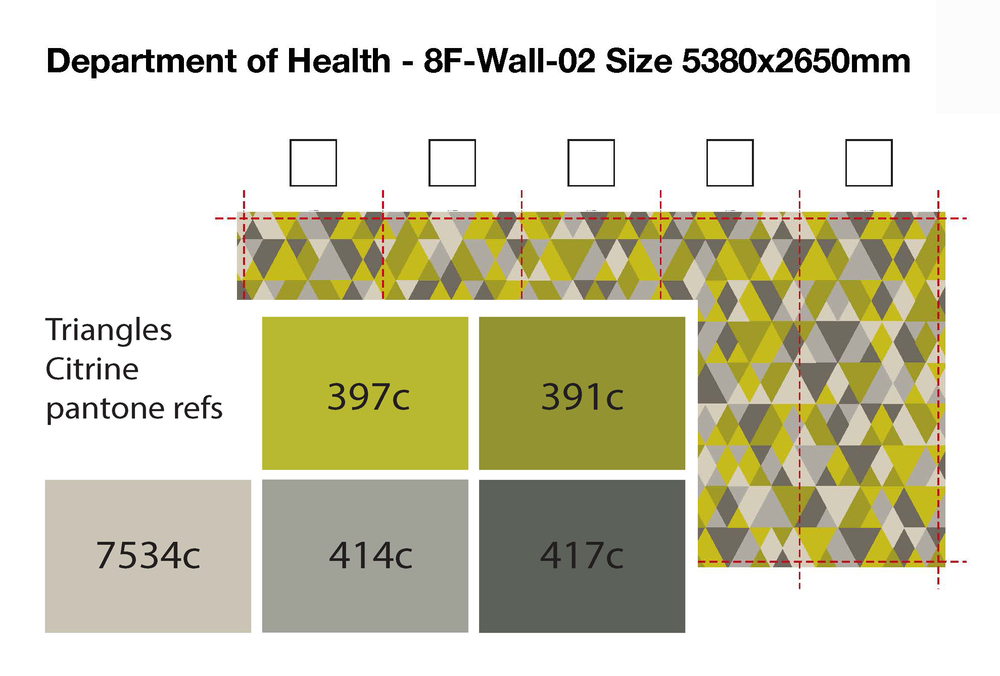
8 floors and 550 square metres of wallcovering later : the interiors for the new head office for the Department of Health are complete. Tthis Cat B fitout recently won 'Best Overall BIM Project' by the RICS for the lead designers Willmott Dixon Interiors.  

Working alongside the DoH, the designers' brief was to create a contemporary environment embracing agile working methods, hot desks and standing desk areas. 

During the project, Willmott Dixon delivered a number of initiatives to promote the construction industry, encourage skills and create jobs. This included site visits for 760 students, 249 young people attending employability workshops and 107 apprentice weeks provided on site.

The modern office space is attracting interest from other Government departments as they look to adopt similar working practices.

Two of our designs were chosen for the project : Triangles Citrine by Jonnie Lawes, and Triangles Too.  Both were custom coloured to match the client's scheme.

Designers : Willmott Dixon Interiors @weareWDI @WillmottD

Jonnie Lawes designs can all be custom coloured to suit. We can resize and repeat to fit any size wall.  Available as wallcovering and window film.  Find out more here

Click here to see more Tektura case studies 

...and here to see news and trend reports

Health care

$
0
0

Tektura are members of the SBID Health Care Council  and we're here to help anyone seeking advice and design guidance in this market sector. The council consists of experts across all aspects of healthcare design, including Stirling University and leading suppliers of lighting, flooring, fabrics, paint and furniture.   

When choosing a wallcovering you may find the following helpful.

DURABILITY and CLEANABILITY.  Wherever possible, choose a fabric-backed vinyl.  They're washable, scrubbable and contain antimicrobials. We offer a small range of super-stain resistant product too. Our fabric-backed vinyl wallcoverings are impact resistant and conform to fire regulations so can be used in any area.  High circulation areas, stairwells, corridors are all prone to more knocks and scrapes.  Fabric-backed vinyls ensure longevity and offer better overall value.  The texture and inks used will determine whether a wallcovering is rated wipeable, washable or scrubbable.  Fabric-backed vinyls with metallic ink prints are washable; vinyls without metallic inks are scrubbable. Avoid metallic effects in high traffic areas as the inks used can scratch more easily.  Avoid abrasive, bleach or solvent based cleaners as these may affect the printed surface of the wallcovering.  For areas requiring extra hygiene or use of stronger cleaning agents, consider our Extra Stain Resistant range.  Non-metallic contract vinyl wallcoverings can be steam-cleaned. 

COLOUR


Warm colours - peach, orange, red and yellow are stimulating. They will 'warm up' a colder or north facing room, and help make a large space feel cosier.  There is evidence that yellow can aid cognition and memory while orange/red can stimulate appetite. Red and bright pink if over-used can lead to agitation.  

Cooler colours - greens, blues and teals are calming. They are reminiscence of water and foliage both of which can relieve stress.  They will make a small area feel more spacious, and a hot room / south facing room feel cooler. There is evidence to suggest that the ability to see blues/greens diminishes more rapidly with age than the ability to see red-based colours.  

LRV's

To ensure the wall/floor/doorway remain distinct from one another and therefore visible, a minimum difference of 30 LRV points between surfaces is recommended.  Conversely, to disguise a doorway choose a wallcovering with similar LRV and the door will stay relatively invisible.  

PATTERN 

For most healthcare environments soft, tonal organic prints are the most appropriate choice.  Traditional damasks, floral or foliage-inspired prints help create a homely non-institutional interior. Classic trellis effects, contemporary geometrics and abstract patterns offer more choice but be mindful of strong aggressive pattern which can create visual disturbance. 

TEXTURE


Vinyl wallcoverings offer a wide range of natural tactile textures such as wood, stone or fabric  effects. These act as a neutral backdrop for signage, lighting and artwork without adding clutter.  For someone with visual impairment, a deep texture can help with wayfinding. 

DEMENTIA

WHAT TO AVOID
Take caution
when choosing bold geometrics, stripes and spots. These can create visual distortion and dizziness.  Shiny surfaces create glare.  Shapes or busy/large patterns may be misconstrued and confusing. Dark patterns on a light background (or vice versa) can be misinterpreted as holes or faces.  Murals incorporating paths may be misleading. 

DEMENTIA FRIENDLY
Consider using fluid patterns, soft shapes and pattern. Patterns should be stylised and era-relevant.  Keep colours within a pattern tonal. Textures add interest.

AUTISM


With regard to wallcovering, creating an autism-friendly environment is about colour.  Choose 'low stimulation' colours such as pale pink, grey, blue and green. Cream should be used instead of white or yellow.  Limit colours to one per area/room to help avoid over stimulation.  Avoid pattern and shiny surfaces.

MURALS

Murals are an easy way of creating an uplifting and engaging interior. Careful planning re scale, content and colour can completely transform a space.  Ensure the mural is relevant to the setting.  They can be realistic or stylised, quirky, hand drawn or mimic a painting. They can fill an entire wall from floor to ceiling or be framed as a large artwork. Any link to an outdoor scene can be uplifting and provide a connection with nature - particularly if there is no view onto a real garden. Murals of green trees and rural landscapes create a connection with nature, reduce stress and aid recovery. Likewise views of lakes, rivers and sea can soothe. Any view creates a positive distraction, is engaging and can evoke memories of familiar places.

Long corridors and particularly end of corridors are areas that benefit from being 'broken up' with colour and pattern. This helps create a homely atmosphere, and can aid wayfinding.

ART & GRAPHICS
Here's a chance to add colour, scale and a story to public areas, waiting rooms and corridors. Playful scenes for paediatrics, photographic or illustrative murals for corridors, reception and dining areas add interest and engage patients, residents and visitors alike.  Many clients choose from our own library of designs, and we can also print customers' own artwork.  


Viewing all 164 articles
Browse latest View live