Quantcast
Channel: Tektura Blog
Viewing all 164 articles
Browse latest View live

CASE STUDY: Renaissance Hotel Amsterdam

$
0
0

It's "Business unusual" - from the Amsterdamse Bos to the Renaissance Hotel Amsterdam Schiphol

A luxury brand by Marriot - the new Renaissance hotel is located on the edge of Amsterdamse Bos (aka the Amsterdam Forest), and is just a stone's throw from Schiphol Airport. And while the hotel has all the facilities expected in an international business hotel - the build and interiors are inspired by the neighbouring woodlands, pathways and waterways of the Amsterdamse Bos itself. A true example of bringing the outside in!

Forest greens, deep blues and soft greys dominate the colour scheme, with timber used throughout along with abstract foliage prints incorporated into flooring and walls.  Greenery abounds in small inner courtyards, and diffused lighting adds to the sense of soft shadows and woodland glades. 

The architects Mulderblauw have also added elements such as the abstract, pared-down aesthetic that reflect the de Stijl art movement from the early 1900's - another nod to the Amsterdamse Bos, which was created in the same period. 

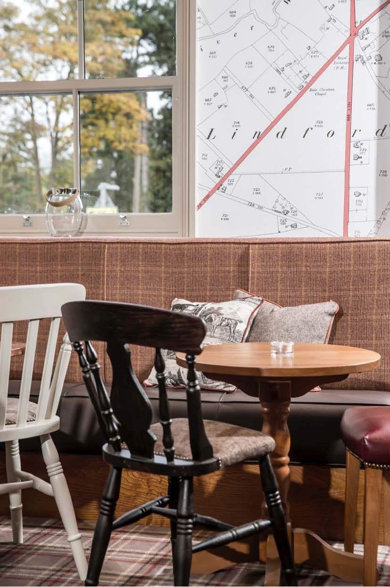
For this project 15000 square metres of wallcovering have been used - a mix of standard designs such as Ellis  were chosen along with unique bespoke prints created for the client.

The leading feature wallcovering  'the Amandelblosem' from our Van Gogh collection can be found on entering the hotel's lobby.  Moving through to the lift lobbies and restaurant, bespoke prints have been created inspired by forest views.   Dark blue Neo Royal wallpaper by Marcel Wanders  adds chic to the restaurant interior. And designs selected from our Loft collection were selected for the gym.

Following through into the bedrooms and suites, textured wallcovering Corsa has been used in soft pebble grey and warm white. And continuing with the biophillic theme, a unique moss green has been created for the walls in all the corridors.

Architect Mulderblauw: “The custom wallcovering was designed in such a way that it fitted seamlessly with the storytellling of the hotel. Mixing standard products with bespoke colours and prints we created the feeling of a walk through the forest. For example, in the fitness room we have a wallcovering that precisely matches the floor and the scanning equipment, creating a totally - timber theme.  For the rooms and suites we were looking for graphic patterns that fit the concept De Stijl, so the Corsa wallcovering design fits perfectly with our concept. "


Join the conversation and let us know your thoughts by following us on Twitter & Instagram (@TekturaTalk) and Facebook (@TekturaWallcoverings).

For more case studies, blogs and trend reports - click here

Or click here to sign up to our newsletter to keep up to date with what's going on and our latest launches.


New Launches January 2019

$
0
0

For our latest launches we looked at colours, trends and styles that we've been seeing throughout our industry and beyond. From this we created 4 groups that form the basis for 18 new designs - let's have a look....

Environmentalist:
It's a strong theme and familiar too ; think natural elements, earthy colours and biophilic design. The environmentalist is all about bringing the outside in as greenery and nature in the interior has been proven time and again to increase overall wellbeing.

Cultural Collector:
Growing fast, this is influenced by travel, discovery, exploration and self expression, our Cultural Collector is an eclectic maximalist who fuses surreal colour with local, tribal and ethnic styles.

Inner Artist:
There are no rules as self expression takes the lead. Focussed on craftsmanship and seeing the mark of the maker, the Inner Artist is all about quality and considered design.

Futurist:
As social media becomes an integral part of our everyday lives, trends and fashions can become global phenomena overnight. Clean and crisp our Futurist theme is all about simplicity, pared down pattern, smooth surfaces, urban living and smart technology.

Now let's have a look the 18 new designs that have been inspired by these trends...

First out of the starting gate is Accelerate!  Here's our abstract block print,  yet close up you'll see illustrative, painterly strokes.  There are 9 colours to choose from including navy blue, vibrant turquoise and simple neutrals - discover them all here.

If it's clean-cut geometrics you're after we've got plenty this launch. Spike is large-scale, contemporary and crisp. A smaller-scale geo with metallic threads, Savvy is smart, simple and sophisticated.  

A pearlescent and deeply textured block effect, Step Up has a contemporary colour palette including on-trend rich green and putty pinks -  see them all here.

You've seen it ..Terrazzo is big news!  Here's our take on the stone effect everyone's talking about - it's smooth and sleek Terrazzo Tap .

Think characterful, roughly woven and rustic - this is Shindig.  Our new design comes in 12 colourways including terracotta, olive green and soft neutrals - see them all here!

Make an impression with painterly print Plaidish. Go bold in denim blue and vibrant turquoise or more subtle in soft neutrals? See all of the colourways here.

There's always room for timeless, versatile design. Here are three weaves, three distinct designs and they're brand new: Luxor is a versatile, matt linen in a sumptuous range of subtle colours from dusky pinks to denim blues and khaki greens. Portobello is a shimmering metalized fine weave and Razzamatazz a colourful, bold intrinsically printed grasscloth.

The mark of the maker at its best : we're slightly obsessed with this unique hammered effect surface with tip-printed metallic highlights, Blacksmith is delicate and detailed. See all 11 colourways of the design here.

Inspired by wood grain, smooth and burnished Burl has a distinct block pattern up close ... but look how it evolves into a more abstract design from afar!  See more of this design here.

We've taken a concrete stone effect base and gone a bit wild.  Here's a leaf overprint and geometric coordinate too.  Urban is our raw, matt textured surface whilst Urban Leaf is all about bringing the outside in; a stylised botanical print with an industrial edge.

Urban maze (the second coordinate to Urban) is our cool, clean geometric. Check out the simple monochromes and shades of grey and putty.

Here's how to make a statement. A large scale abstract print, Big Sur Block is dramatic and daring. Splashes of paint collide on a canvas ground in blue/bronze, black/white and slightly more subtle cream combos.  There's a coordinate too: Big Sur offers the plain canvas in a multitude of colours from simple neutrals to vivid turquoise, yellow and pink.

Ticking the boxes for our all our themes : a burnished woodblock texture, Bevel is a multi-layered print that is chic and contemporary.

Join the conversation and let us know your thoughts by following us on Twitter & Instagram (@TekturaTalk) and Facebook (@TekturaWallcoverings).

For more case studies, blogs and trend reports - click here

Or click here to sign up to our newsletter to keep up to date with what's going on and our latest launches.

Heimtextil and Maison & Objet roundup 2019

$
0
0

Didn't get a chance to visit Heimtextil or Maison & Objet this year? Don't worry, here's a quick round up of some of the trends displayed at each show


Heimtextil 2019 - "Toward Utopia":
Heimtextil's trend space was all about choosing your own utopia. Whether through escapism or finding sanctuary, it's all about constructing your own safe space. Let's have a look at the 5 areas...

Pursue Play:
In an era of uncertainty, political instability and environmental problems, we satisfy our need for optimism and creativity with play.  Designers focus on tactile interactions and daring designs have a touch of humour! Shapes and colour palettes take on a touch of surrealism as the use of rich primary colours is playful and naive. Together abstract forms and a bold play with patterns & textures challenge us to be imaginative.


Escape Reality:
A new utopia can be rooted in both the digital and the real. The potential of virtual and extended reality blurs the boundaries between fantasy and reality. Shimmering, iridescent surfaces can be transformed by movement and create a fleeting, intangible form of motion. Mother-of-pearl effects and high gloss give a sense of fluidity and movement, whilst ethereal combinations of light pastel shades create a surrealistic, hyper-real mood.


Embrace Indulgence:
High-quality materials and rich colours, a modernist style and solid craftsmanship combine to form a vision of the future of luxury. In a modern age marked by uncertainty, we look back through rose-tinted glasses to earlier eras, remember the comfort of the good old days, long for security and surround ourselves with a calm, inviting aesthetic. Cleverly combined, honest materials and simple opulence form a new kind of comfort.


Go Off Grid:
The search for a closeness to nature leads to a yearning to live more naturally, to return to the origins of humanity and to live in harmony with nature – and not against it. Go Off Grid is about the cross-over of survival in remote locations, supported by high-tech equipment. The combination of hard-wearing outdoor textiles and workwear, utilitarian aesthetic, durability and functionality. Colours and patterns are inspired by nature and celebrate the supposed “imperfection” of the natural world.


Seek Sanctuary:
In the midst of our intense, hyper-connected everyday life, more and more people are looking for ways to “cut off” all connections – for a utopian haven of peace amidst all the noise. They retreat to oases where they can switch off to find relaxation. Seek Sanctuary is about the search for and appreciation of design that is simple, beautiful, functional and high quality. The combination of a minimalist colour palette with structural details, curved shapes and upholstery gives rise to comfort and warmth.


Maison & Objet 2019 - "Excuse my French!":

Excuse my French!:
Maison's trend area was all about celebrating French identity. “There’s a renewed curiosity about the French abroad, a sort of fascination at the moment”, states Vincent Grégoire from the Paris-based forecasting agency NellyRodi. For him, the movement is linked to globalisation: “In a world where things are becoming standardized, people are looking for something different”. The trend area thus showcased French brands and designers, as it highlighted the Made in France phenomenon. 


Want to see more? Follow the links to see our Pinterest boards for both Heimtextil 2019 and Maison & Objet 2019.

Join the conversation and let us know your thoughts by following us on Twitter & Instagram (@TekturaTalk) and Facebook (@TekturaWallcoverings).

For more case studies, blogs and trend reports - click here

Or click here to sign up to our newsletter to keep up to date with what's going on and our latest launches.

CASE STUDY: Restyling De Librije’s Hotel

$
0
0

10 rooms at De Librije’s hotel have been restyled using our Neo Royal by Marcel Wanders wallcoverings. Interiors by Ingrid van der Veen.

Located in a former women's prison, the De Librije's building dates back to the beginning of the eighteenth century. Over 5 years the building was restored and renovated by owners Jonnie and Thérèse Boer, and was officially opened in May 2008. Parts of the old women's prison were preserved in the monumental building. The cell doors, bars on the windows and 'dungeon' give this hotel it's unique appearance and atmosphere. In recent renovations 10 of the hotel's guest suites have been revamped using statement wallcoverings from our Neo Royal by Marcel Wanders collection. Let's have a look...


Neo Royal by Marcel Wanders Collection at De Librije's Hotel, Netherlands. Interiors by Ingrid van der Veen
 

Neo Royal by Marcel Wanders Collection at De Librije's Hotel, Netherlands. Interiors by Ingrid van der Veen

De Librije’s Hotel offers its guests what owners Jonnie and Thérèse describe as the “ultimate hotel experience”. Each room at the hotel was designed with its own story and character in mind. This was important for Jonnie and Thérèse, as they wanted it to remain a unique experience on every stay for both new and returning guests. 

Interior designer Ingrid van der Veen rose to the challenge, creating distinct and eclectic rooms full of colour and imaginative design details that each have an individual atmosphere.


Neo Royal by Marcel Wanders Collection at De Librije's Hotel, Netherlands. Interiors by Ingrid van der Veen

Neo Royal by Marcel Wanders Collection at De Librije's Hotel, Netherlands. Interiors by Ingrid van der Veen

Neo Royal by Marcel Wanders Collection at De Librije's Hotel, Netherlands. Interiors by Ingrid van der Veen

We love Ingrid's use of bold jewel tones - sapphire, emerald, amethyst and ruby - as the basis for the rooms. It gives each room its own strong sense of identity, yet they feel united in their style. 

Ingrid about the rooms:"I chose a colour scheme and atmosphere for each room. The Neo Royal by Marcel Wanders collection fits in well with my design style; tough, yet elegant and it has a luxurious look"

With every corner of the rooms clearly carefully considered, we think the rooms are a triumph in maximalist design! There's only thing left to decide now ... which room are you going to stay in?


See all the ecclectic designs used at De Librije's and more in our Neo Royal Collection by Marcel Wanders here.


Join the conversation and let us know your thoughts by following us on Twitter & Instagram (@TekturaTalk) and Facebook (@TekturaWallcoverings).

For more case studies, blogs and trend reports - click here

Or click here to sign up to our newsletter to keep up to date with what's going on and our latest launches.

Recolouring new Jonnie Lawes designs

$
0
0

All our Jonnie Lawes wallcoverings can be recoloured for your perfect custom design. So we thought we'd show you a sneak peek of what goes on behind the scenes when choosing some of our colour combos and the inspiration behind them...

Plus we have 3 brand new designs by Jonnie Lawes - Landscape, Slatted and Trees Geo - have a look below to see them all.

Dreamy landscapes meet the architectural geometry of Jonnie Lawes' designs. The indigo blues and deep navy preserve the relaxing vibe of a scandinavian mountain scene, whilst the sharp edges of Jonnie's distinctive style keeps it fresh and modern. Click to see our new Landscape design

Forest greens and steel blues - nature fuses with urban in our new design Slatted Outline pictured here. Crisp and bright, we wanted the design to be a new contemporary twist on biophilic design.

Trees like you haven't seen them before! Burnt umber and caramel, together with gravel grey and dusky blue - inspired by natural wood tones and mirrored reflections, it's a combination of colours that brings warmth with an edge. Click to see our new Trees Geo design. 

Dusky pink and navy blue - a colour combo made in heaven! Paired with putty blush and silvery grey we wanted this design to be modern and chic. Click to see our Collage Block design pictured here.

This vibrant combination of zesty lime green and sky blue makes us feel like summer all year round! Is it time to book a holiday yet? Click to see our Collage Shapes design.

Terracotta, cinnamon and peach - a warm tonal colour combo that mixes retro with modern. The 70s are back and we're loving it! See our Shatter Copper design here.

Candy colours in pastels! We paired bubblegum pink and mint green with simple greys for a fun filled  graphic design that is super sweet. Click to see our Angel Pink and Green design.


Have specific colours in mind? Want to match to a pantone reference? We can do that too! Get in contact here to see how we can help you


All designs can be printed as window graphic or wallcovering. Check out all of our Jonnie designs here


Join the conversation and let us know your thoughts by following us on Twitter & Instagram (@TekturaTalk) and Facebook (@TekturaWallcoverings).

For more case studies, blogs and trend reports - click here

Or click here to sign up to our newsletter to keep up to date with what's going on and our latest launches.

NEW DESIGNS: Bring nature to the interior with our Richard Osbourne murals

$
0
0

With biophilic design still the phrase on everyone's lips, we've launched 5 brand new Richard Osbourne murals. Super high-res and incredibly detailed, these panoramic murals are an easy and effecive way to bring nature into the interior. 


But quickly! In case you need a refresh, here's a brief overview of what biophilic design is and the benefits it can bring...

Biophilia is the idea that we possess an innate tendency to seek connections with nature. Biophilic design is the use of and link to nature in the design of a space, as a way to improve the user's health and wellbeing.

In other words, for interior design, it's all about bringing the outdoors into the interior!

There have been numerous studies over the last 35 years on the benefits of bringing a natural connection into the interior:

  • Office design: productivity can be increased by 8%, rates of well-being up by 13%, increases in creativity, with reduced absenteeism and presenteeism
  • Hospitality design: guests are willing to pay 23% more for rooms with views of biophilic elements
  • Education spaces: increased rates of learning 20-25%, improved test results, concentration levels and attendance, reduced impacts of ADHD
  • Healthcare spaces: post-operative recovery times decreased by 8.5%, reduced pain medication by 22%
  • Retail: the presence of vegetation & landscaping has been found to increase average rental rates on retail spaces with customers indicating they were willing to pay 8-12 % more for goods and services.
(Statistics from Oliver Heath Design)


Convinced yet? Our 5 latest Richard Osbourne murals are where we see the next step in biophilic design heading - a different take on colour, perspective and design - each mural brings something new to the world of biophilia. Let's take a look...


NEW Richard Osbourne photographic mural - WATERFALL

Scramble over the rocky rapids and be transported into the lush and wild landscape of our new Waterfall photographic mural. Available as wallcovering and window film, Waterfall can be scaled up to 3 x 6.25m.


NEW Richard Osbourne photographic mural - BRACKEN WOOD

Enter the misty morning of Bracken Wood. In cosy tones of burnt umber, caramel and sage you can practically feel the crunch of leaves underfoot. A super high res panorama, Bracken Wood can be scaled up to 3 x 14m.


NEW Richard Osbourne photographic mural - AUTUMN LEAVES

Who says biophilic design needs to be restricted to green tones and colour palettes? In cheerful shades of sunny yellow and sky blue, Autumn Leaves is a colourful quirky option for bringing nature into the interior. Autumn Leaves can be scaled up to 3 x 4.5m.


NEW Richard Osbourne photographic mural - SPRINGTIME

Look up! Fresh greens and cornflower blues shine through in our new Spingtime mural. Dwarfed by towering leafy trees, step into the lucious forest of Springtime (this mural can be scaled up to 3 x 4m).


NEW Richard Osbourne photographic mural - LAKE

Plunge into the serene landscape of our new Lake design. A calming photographic mural, Lake can be scaled up to 3 x 6m.


All designs can be printed as window graphic or wallcovering and we can resize and print Richard's images to fit your space. Turn round is fast and there's no minimum order. Discover all of our Richard Osbourne designs here


Join the conversation and let us know your thoughts by following us on Twitter & Instagram (@TekturaTalk) and Facebook (@TekturaWallcoverings).

For more case studies, blogs and trend reports - click here

Or click here to sign up to our newsletter to keep up to date with what's going on and our latest launches.

CASE STUDY: Pearl Building, Newcastle

$
0
0

Let's travel up north! Delivering offices for entrepreneurial businesses, the Pearl Building is a rejuvenated Newcastle city centre icon. With workplace design a hot topic when talking about employee satisfaction, productivity and wellbeing, Design North Interiors were briefed to create a vibrant breakout space to support the existing serviced offices ...And they used a wide selection of our wallcoverings to help achieve this - let's take a look:

Bold and bright, Design North Interiors used a variety of our wallcoverings including our Laura Hart Playful design (pictured top). Used as a feature wall, the eye-catching geometric design is a quirky way to bring the surrounding city skyline into the interior. Paired with inviting armchairs, Design North also employed a clever use of carpet design to help create zoned seating areas.

Spot the difference! No, that's not exposed brick, it's our realistic wallcovering alternative. We love the contrast of the red brick design from our More Than Elements wallcovering collection with the zingy blue wall. Click here to see more brick, wood and stone effects from the collection.

A statement in yellow! Research has shown that yellow is perceived as an optimistic and energetic colour, it can therefore be a great colour to use in work environments as it promotes innovation and creativity. Our Van Gogh collection wallcovering pictured here is an eye catching accompaniment to the vibrant yet practical noise-cancelling furniture.

Using an industrial aesthetic is a great way to bring a cool urban edge to an office interior. This reclaimed wood effect wallcovering (from our More Than Elements collection) makes the perfect practical alternative to the real thing, and still creates a vibrant statement wall for the breakout area.

Two shades of brick (again from our More Than Elements wallcovering collection) feature below in this industrial chic meeting area. Paired with exposed bulb lighting, it continues the urban vibe across the space of the office.

Pictured: Laura Hart, Playful wallcovering at The Pearl Building, Newcastle. Interiors by Design North

With employees spending more and more time at the office, it's crucial to create a space that’s functional, visually appealing, comfortable, and inviting — all of which promote productivity and efficiency.  Also for visitors or customers, office design sets the tone for a business and tells a story about the brand, professionalism, and success.

Join the conversation and let us know your thoughts by following us on Twitter & Instagram (@TekturaTalk) and Facebook (@TekturaWallcoverings).

For more case studies, blogs and trend reports - click here

Or click here to sign up to our newsletter to keep up to date with what's going on and our latest launches.

NEW LAUNCHES June 2019

$
0
0
Our brand new launches show how designs and colours are evolving in 2019.  (...and for the whole background story read here)

Do you recall two of our themes for this year - the Inner Artist and Futurist ?  Our new designs take us onto the next step... ready to see how the story evolves?

Inner Artist:
There are no rules as self expression takes the lead.  Focussed on authenticity, craftsmanship and seeing the mark of the maker, the Inner Artist is all about quality and considered design.

Continuing with this theme, our latest intros now concentrate on metals. Brass, gold, bronze and copper take centre stage.  Paired with the simplicity of black and white...and a dash of indigo, traditional materials take on a contemporary edge.

Futurist:
As social media becomes an integral part of our everyday lives, trends and fashions can become a global phenomena overnight.  Clean and crisp our Futurist theme is all about simplicity, pared down pattern, smooth surfaces, urban living and smart technology.

Keeping with this modern and graphic vibe, our new designs introduce on-trend duck egg and soft blues into the mix.

Now, let's look at the 16 new designs...

First up is Mali.  A graphic print, Mali is inspired by authentic African mudcloth fabrics. Each mudcloth pattern has a special meaning depending on the region, ethnic group and individual that created it.  Mali is based on the "Iguana’s elbow" design.  A simple chevron pattern, we're told it brings good fortune as it symbolises the iguana leading the hunter to water.

Next up are 2 small scale designs: Scaffold and Quiet.  Scaffold is a mini geometric with an architectural vibe. Quiet is a versatile, delicate and stylised weave. See the whole range here.

Keeping in touch with nature, Bonsai is a shadowy bamboo print on a grasscloth texture.  It's elegant, sophisticated and inspired by hand-painted Japanese art.  Bonsai comes in 6 classic and soft neutral colourways - click to see them all

A pearlescent textured chevron; we've taken a shine to our new horizontal design Maze.  From silvery blues to warm golds, you can see all 10 metallic colourways here.

A tribal inspired painterly print, Dabble comes in 8 colourways ranging from inky indigo blue to metallic silver or gold - discover them all here.

A statement in zigzag!  A graphic geometric design, Abstract is inspired by origami folds and angular architecture.  Click to see more.

Chunky textured blocks and wedges create this stunning small-scale geometric.  With colours ranging from petrol green to duck egg blue, you can discover all 12 colourways of Skylight here.

A blend of tree bark and stone.  Flashes of metallic foil peek through in this block-like design, Neolithic.

A finely textured and burnished grasscloth, some colours in Machiko have a holographic effect whilst others are a statement in metallic.  With 24 colours to choose from, you can discover them all here

Dramatic and painterly, Cloud is perfect for a statement wall in bold navy and black or equally good in it's more subtle, neutral tones.  It also has a coordinate, Cloud Canvas.  A finely textured weave, selected colours are metallised.  See all 30 colourways here.

It's all about the metallics with pearlised mosaic design Stagger.  A small scale and deeply textured design, you can see all 21 colours here.

Brush with Fame combines the ebb and flow of ocean waves with painterly brushstrokes to create a statement stripe mural.  Click to see all 6 colourways.

An ikat inspired trellis print, Skyward Grill is a classic, and coordinates with silky weave Skyward.  From versatile neutrals to rich jewel tones - discover all the new colourways here.


To see all our latest designs and explore our current library follow the link here.


Join the conversation and let us know your thoughts by following us on Twitter & Instagram (@TekturaTalk) and Facebook (@TekturaWallcoverings).

For case studies, blogs and trend reports - click here

Or click here to sign up to our newsletter to keep up to date with what's going on and our latest launches.


NEW DESIGNER: Kata Lips

$
0
0

Introducing our collaboration with designer Kata Lips!

An established international artist, Kata Lips' colourful and abstract landscapes are inspired by Japanese culture and design.

Using her own unique techniques, Kata pours oils, water and paints onto her canvases, then tilts and lifts the screens allowing the colours to flow naturally. Zen-like landscapes emerge; colours bleed and diffuse. Structural shapes are then painted by hand, creating abstract silhouettes, branches and trees. 

We have translated these artworks into 2 unique wallcoverings Kigi and Shinrin - available in 25 colourways. Let's take a look...

All designs shown here have been created exclusively for Tektura. Our first design Shinrin can be scaled up to fill a wall 3m x 7.5m. Kigi is 3m x 5m.  Both can be cropped, or repeated length-wise to fit a longer wall.  Colours can be adjusted, and all designs are available as wallcovering or window film. Check out all of our Kata Lips designs here

Join the conversation and let us know your thoughts by following us on Twitter & Instagram (@TekturaTalk) and Facebook (@TekturaWallcoverings).

For more case studies, blogs and trend reports - click here

Or click here to sign up to our newsletter to keep up to date with what's going on and our latest launches.


9 Geometric Interiors that have the right kind of edge!

$
0
0

Client showroom, Dublin - Metal Triangles Bronze wallcovering by Tektura

Onesubsea canteen - Geo Texture wallcovering by Tektura

Warner hotel - Essentials collection wallcovering by Tektura

Student accomodation, Birmingham - Concrete Chevron wallcovering by Tektura


Credit: Advanced Commercial Interiors Ltd

Offices, Nottingham - Custom coloured Jonnie Lawes Triangleswallcovering by Tektura

Solicitors offices - Custom coloured Jonnie Lawes Diamond and Geometrics Quartz wallcoverings by Tektura

Department of Health, London - Jonnie Lawes Triangles Citrine wallcovering by Tektura

Custom coloured Jonnie Lawes Wedge wallcovering by Tektura

Hotel, Dublin - Abakan wallcovering by Tektura


Do you agree?

Join the conversation and let us know your thoughts by following us on Twitter & Instagram (@TekturaTalk) and Facebook (@TekturaWallcoverings).

For more case studies, blogs and trend reports - click here

Or click here to sign up to our newsletter to keep up to date with what's going on and our latest launches.

Maximalism alert ! Meet Modern Love our latest digital designers...

$
0
0

Take a former fashion editor for Elle, combine with an illustrator/fashion designer ... and the result is MODERN LOVE.  They've collaborated with Escada, Christian Dior, Liberty... and now Tektura ! 

Illustrator and fashion designer Sarah Arnett and former Elle fashion editor Kim Hunt are Modern Love. Based in Brighton, they hail from the world of high end fashion.

Now they're moving into interiors and have created a set of stunning murals exclusively for Tektura. Let's have a look...

Each mural is designed to reach 3 metres high and span walls 5 metres wide.  Designs can be repeated for longer walls. 

There's a strong oriental influence in many of Modern Love designs - in Kyoto magnolia trees climb up from the ground, where Japanese-inspired pattern picks out each contour, rise and fall of the land.  Intricately detailed damasks create the clouds and sky.

Mystical landscapes are saturated with colour and a thousand tiny details.  Influenced by ancient art, oriental pattern, African vibes and Asian artefacts, Sarah and Kim are modern day storytellers.  


A kaleidoscope of colour, clashing pattern and detail: Wonderland has everything. To appreciate each detail, get up close. 

A stairway leads you to the Secret Garden where we find campaniles and minarets tucked away behind palms and ferns. 


Sarah and Kim (aka Modern Love) have journeyed the world; collecting artefacts, fabrics and memories along the way. Cabinet of Curiosities is their story - of the people they've met, the places they've been.  Each item in the cabinet has a tale to tell. 

Look closely and you'll find a little monkey hidden amongst the palms.  Available in three shades : pale, bronze and dark - each version of Jungle Palms creates a stunning backdrop for commercial and residential schemes alike.

And a homage to Frida Kahlo - this intricate garden scene bursts with colour, pattern and sheer zest for life. 

All designs are offered as wallcovering, window film or acrylic panels.  Sarah and Kim will also undertake commissions to create a totally unique made-to-measure design for clients, as well as fabrics and upholstery.  If you're interested find out more here... 

If you'd like to find out more about any of our Modern Love designs or see all colourways, please click on the individual links here: Cabinet Of Curiosoties, Kyoto, Jungle Palms, Midnight, Secret Garden, Wonderland, Fridas Garden 


Join the conversation and let us know your thoughts by following us on Twitter & Instagram (@TekturaTalk) and Facebook (@TekturaWallcoverings).

For more case studies, blogs and trend reports - click here

Or click here to sign up to our newsletter to keep up to date with what's going on and our latest launches.

Bring nature inside with our Richard Osbourne murals

$
0
0

Wellness and biophilic design are essential in interior design. Research shows we all possess an innate tendency to seek out connections with nature, and by introducing these elements into design, our health and wellbeing are improved.  It's all about bringing the outdoors in!

And so we're launching 5 brand new Richard Osbourne murals. Super high-res and detailed, these panoramic images are an easy and effective way to bring greenery, woodlands and peaceful scenes into an interior space.  Here we show different takes on colour, perspective and design - each mural brings something new to the world of biophilia. Let's take a look... 


NEW Richard Osbourne photographic mural - SPRINGTIME

Look up! Fresh greens and cornflower blues shine through in our new Springtime mural. Dwarfed by towering leafy trees, step into the luscious forest of Springtime (this mural can be scaled up to 3 x 4m).


NEW Richard Osbourne photographic mural - BRACKEN WOOD

Here's the misty morning of Bracken Wood. In autumnal tones of burnt umber, caramel and sage you can practically feel the crunch of leaves underfoot. A super high res panorama, Bracken Wood can be scaled up to 3 x 14m.


NEW Richard Osbourne photographic mural - WATERFALL

Scramble over the rocky rapids and be transported into the lush and wild landscape of our Waterfall photographic mural. Available as wallcovering and window film, Waterfall can be scaled up to 3 x 6.25m.

T

NEW Richard Osbourne photographic mural - AUTUMN LEAVES

Who says biophilic design needs to be restricted to green tones and colour palettes? In cheerful shades of sunny yellow and sky blue, Autumn Leaves is a colourful option for bringing nature into the interior. Autumn Leaves can be scaled up to 3 x 4.5m.


NEW Richard Osbourne photographic mural - LAKE

Plunge into the serene landscape of our new Lake design. A calming photographic mural, Lake can be scaled up to 3 x 6m.

All designs can be printed as window graphic or wallcovering and we can resize and print Richard's images to fit your space. Turn round is fast and there's no minimum order.  And this is just a small selection - discover all of our Richard Osbourne designs here

Join the conversation and let us know your thoughts by following us on Twitter & Instagram (@TekturaTalk) and Facebook (@TekturaWallcoverings).

For more case studies, blogs and trend reports - click here

Or click here to sign up to our newsletter to keep up to date with what's going on and our latest launches.

NEW DESIGNER: Alé Art Studio

$
0
0

Introducing our collaboration with Alessandro Scanziani of Alé Art Studio!

We're delighted to be working with Alessandro Scanziani, founder of @Alé Art Studio. We have translated 6 of Aléssandro's artworks into wallcoverings to bring your walls to life!

Inspired by nature, classical art and natural surfaces, our talented Bergamo-based artist transforms his ideas into illustrative artworks using oils, watercolours, pen and ink to create realistic surface textures and landscapes full of detail and character.  

Here we show you a glimpse of the range as we get close up and explore the concepts behind these beautiful and unique designs. 


All designs shown here have been created exclusively for Tektura and can be sized to fit any space. Trees Chiaroscuro can be scaled up to 3m in height, and can be repeated widthways. Metal Tiles can be repeated up or across to fit any size wall . Orientale can be printed with or without birds or panels. Colours can be adjusted, and all designs are available as wallcovering or window film. Wallcoverings can be supplied on a wide variety of base textures including silks, grasscloths, stone, canvas and metallic effects with stunning results. Check out the complete range of Alé Art Studios' designs here!


Join the conversation and let us know your thoughts by following us on Twitter & Instagram (@TekturaTalk) and Facebook (@TekturaWallcoverings). See Our latest inpirations and launches on Pinterest @tektura wallcoverings 

For more case studies, blogs and trend reports - click here. 

click here to sign up to our newsletter to keep up to date with what's going on including our latest launches.

CASE STUDY : Awarded "Best overall BIM Project" by RICS

$
0
0

8 floors and 550 square metres of wallcovering later : the interiors for the new head office for the Department of Health are complete. Tthis Cat B fitout recently won 'Best Overall BIM Project' by the RICS for the lead designers Willmott Dixon Interiors.  

Working alongside the DoH, the designers' brief was to create a contemporary environment embracing agile working methods, hot desks and standing desk areas. 

During the project, Willmott Dixon delivered a number of initiatives to promote the construction industry, encourage skills and create jobs. This included site visits for 760 students, 249 young people attending employability workshops and 107 apprentice weeks provided on site.

The modern office space is attracting interest from other Government departments as they look to adopt similar working practices.

Two of our designs were chosen for the project : Triangles Citrine by Jonnie Lawes, and Triangles Too.  Both were custom coloured to match the client's scheme.

Designers : Willmott Dixon Interiors @weareWDI @WillmottD

Photography by Michael Whitestone photography

Jonnie Lawes designs can all be custom coloured to suit. We can resize and repeat to fit any size wall.  Available as wallcovering, window film and acoustic panels. Find out more here

Click here to see more Tektura case studies 

...and here to see news and trend reports

CASE STUDY : QE2 Hospital, Birmingham

$
0
0

Following several small refurbishments, the interior of the Radiotherapy unit in the QE2 Hospital, Birmingham has now been thoroughly modernised and updated. 

In line with the design brief, the waiting area has been redesigned to create a welcoming, homely atmosphere.  

Working with a neutral background, splashes of colour have been chosen to add warmth. Floor finishes help differentiate between zones.  

The Tektura wallcoverings selected are from our bespoke/made to measure range.  Colours can be customised, and designs can all be resized to fit any interior scheme.  

Twiggy and Watercolour Spots are from Tektura's own design studio.  And Little Blotches has been designed specially for Tektura by Timorous Beasties. If you'd like to find out a little bit more about the designs chosen, please click on the links here : TWIGGY, WATERCOLOUR SPOTS, and LITTLE BLOTCH

Interiors by RPS Architects, Birmingham

For regular news, case studies and product intros, do have a look at our blog. 


CASE STUDY : The Keel, Queens Dock, Liverpool

$
0
0

Built in 1993, these old HMRC offices once held over 1,500 employees  - but now the site is home to 240 apartments, and all have a waterside view. 

Tektura's wallcoverings are used throughout - with our geometric design Metal Triangles used not only in public areas, but also in the individual apartments.   Metal Triangles is one of Tektura's made-to-order prints. Colours can be customised, patterns rescaled and we can print onto a whole host of background textures with stunning results. If you'd like to know more about our bespoke service, please click here. 

Public areas also include Tektura'sApex Cord - a subtle textured grasscloth effect

Award winning designers Space Invaders created the scheme. 

To learn more about The Keel - click here.    And to see more Tektura case studies, news and views, please click here. 

CASE STUDY : The Royal Exchange in Lindford is transformed

$
0
0

With a history dating back more than 200 years, The Royal Exchange in Lindford underwent a complete makeover in 2015.  


The old village pub required complete structural and internal refurbishment, and work included replacing the 17th century roof.  

Tektura helped select an historical map of the local area, which we then printed as a wallcovering. 

Refurbishment by Jones Architecture & Design. 

If you would like to find our more about bespoke printed maps, please click here.  We can print as wallcovering, window film or acoustic panels. Or for alternative ideas have a look at our complete library of made to measure designs. We also print clients' own artwork. 


CASE STUDY : Bespoke wallcoverings at MC6

$
0
0

MC6 (Middlesbrough College sixth form centre) have opened the doors to a new extension which provides first-class learning facilities to students in the area. The extension is part of the development of Middlehaven - a former derelict brownfield site and the largest regeneration scheme outside London. It honours the importance of Middlehaven in Middlesbrough's history by retaining the Victorian façade of the former sail-making workshops.

Our Treasure fabric-backed vinyl wallcovering was used in common areas around the college. Niven Architects also commissioned Tektura to create bespoke Word Cloud designs incorporating book titles, sports personalities, and famous people throughout history. These designs reflect the shapes of the building, and tie together the colours of the interior design scheme.

Sports personalities Word Cloud wallcovering.

 Main corridor for the sports building featuring the sports personalities wallcovering

Famous people wallcovering in the student cafe

 Pops of pink, green, blue and purple form the colour scheme for the entire building

 Professor Lord Robert Winston at the opening of MC6

We have a wide selection of designs for you to choose from, all printed to fit your wall dimensions and most can be custom coloured. We can also create bespoke artwork for you, and print onto any of our wallcoverings, or print onto our acoustic panels. For samples and further information have a look at our website or contact 020 7536 3300 or digital@tektura.com.


Health care

$
0
0

Tektura are members of the SBID Health Care Council  and we're here to help anyone seeking advice and design guidance in this market sector. The council consists of experts across all aspects of healthcare design, including Stirling University and leading suppliers of lighting, flooring, fabrics, paint and furniture.   

When choosing a wallcovering you may find the following helpful.

DURABILITY and CLEANABILITY.  Wherever possible, choose a fabric-backed vinyl.  They're washable, scrubbable and contain antimicrobials. We offer a small range of super-stain resistant product too. Our fabric-backed vinyl wallcoverings are impact resistant and conform to fire regulations so can be used in any area.  High circulation areas, stairwells, corridors are all prone to more knocks and scrapes.  Fabric-backed vinyls ensure longevity and offer better overall value.  The texture and inks used will determine whether a wallcovering is rated wipeable, washable or scrubbable.  Fabric-backed vinyls with metallic ink prints are washable; vinyls without metallic inks are scrubbable. Avoid metallic effects in high traffic areas as the inks used can scratch more easily.  Avoid abrasive, bleach or solvent based cleaners as these may affect the printed surface of the wallcovering.  For areas requiring extra hygiene or use of stronger cleaning agents, consider our Extra Stain Resistant range.  Non-metallic contract vinyl wallcoverings can be steam-cleaned. 

COLOUR


Warm colours - peach, orange, red and yellow are stimulating. They will 'warm up' a colder or north facing room, and help make a large space feel cosier.  There is evidence that yellow can aid cognition and memory while orange/red can stimulate appetite. Red and bright pink if over-used can lead to agitation.  

Cooler colours - greens, blues and teals are calming. They are reminiscence of water and foliage both of which can relieve stress.  They will make a small area feel more spacious, and a hot room / south facing room feel cooler. There is evidence to suggest that the ability to see blues/greens diminishes more rapidly with age than the ability to see red-based colours.  

LRV's

To ensure the wall/floor/doorway remain distinct from one another and therefore visible, a minimum difference of 30 LRV points between surfaces is recommended.  Conversely, to disguise a doorway choose a wallcovering with similar LRV and the door will stay relatively invisible.  

PATTERN 

For most healthcare environments soft, tonal organic prints are the most appropriate choice.  Traditional damasks, floral or foliage-inspired prints help create a homely non-institutional interior. Classic trellis effects, contemporary geometrics and abstract patterns offer more choice but be mindful of strong aggressive pattern which can create visual disturbance. 

TEXTURE


Vinyl wallcoverings offer a wide range of natural tactile textures such as wood, stone or fabric  effects. These act as a neutral backdrop for signage, lighting and artwork without adding clutter.  For someone with visual impairment, a deep texture can help with wayfinding. 

DEMENTIA

WHAT TO AVOID
Take caution
when choosing bold geometrics, stripes and spots. These can create visual distortion and dizziness.  Shiny surfaces create glare.  Shapes or busy/large patterns may be misconstrued and confusing. Dark patterns on a light background (or vice versa) can be misinterpreted as holes or faces.  Murals incorporating paths may be misleading. 

DEMENTIA FRIENDLY
Consider using fluid patterns, soft shapes and pattern. Patterns should be stylised and era-relevant.  Keep colours within a pattern tonal. Textures add interest.

AUTISM


With regard to wallcovering, creating an autism-friendly environment is about colour.  Choose 'low stimulation' colours such as pale pink, grey, blue and green. Cream should be used instead of white or yellow.  Limit colours to one per area/room to help avoid over stimulation.  Avoid pattern and shiny surfaces.

MURALS

Murals are an easy way of creating an uplifting and engaging interior. Careful planning re scale, content and colour can completely transform a space.  Ensure the mural is relevant to the setting.  They can be realistic or stylised, quirky, hand drawn or mimic a painting. They can fill an entire wall from floor to ceiling or be framed as a large artwork. Any link to an outdoor scene can be uplifting and provide a connection with nature - particularly if there is no view onto a real garden. Murals of green trees and rural landscapes create a connection with nature, reduce stress and aid recovery. Likewise views of lakes, rivers and sea can soothe. Any view creates a positive distraction, is engaging and can evoke memories of familiar places.

Long corridors and particularly end of corridors are areas that benefit from being 'broken up' with colour and pattern. This helps create a homely atmosphere, and can aid wayfinding.

ART & GRAPHICS
Here's a chance to add colour, scale and a story to public areas, waiting rooms and corridors. Playful scenes for paediatrics, photographic or illustrative murals for corridors, reception and dining areas add interest and engage patients, residents and visitors alike.  Many clients choose from our own library of designs, and we can also print customers' own artwork.  


CASE STUDY: Zurich Insurance

$
0
0

With over 2000 square metres floor space, Zurich Insurance has a new base in Birmingham.  340 employees have relocated to the newly refurbished 14-storey Colmore Building in the city centre.

PJE Business Solutions provided Zurich Insurance with a CAT B design and fitout service, and the new premises include office spaces, breakout areas, dining facilities and meeting rooms.

Tektura's Zintra acoustic panels and screens have been used throughout, providing a decorative and acoustic solution, with colours and patterns keeping in line with Zurich's own branding.

The images above show a custom design supplied in 2 configurations : Zintra sliding panels provide privacy, and decorative cut-out screens aid zoning in open plan areas. 

Tektura's Zintra ceiling baffles in three colours provide additional sound absorption.

For dividing walls and meeting rooms, Tektura's wallcoverings Zig Zag Grand, More than Elements, and Angles Weave have been chosen.

Find out more about each product :
Zintra Acoustic panels
Zig Zag Grand
More than Elements
Angles Weave

Join the conversation and let us know your thoughts by following us on Twitter & Instagram (@TekturaTalk) and Facebook (@TekturaWallcoverings). See Our latest inspirations and launches on Pinterest @tektura wallcoverings 

For more case studies, blogs and trend reports - click here. 

Click here to sign up to our newsletter to keep up to date with what's going on including our latest launches.

Viewing all 164 articles
Browse latest View live